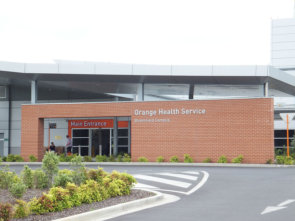
The redevelopment of Orange Hospital was a major investment in regional health infrastructure, delivered through a public–private partnership. Designed to serve as a key referral hospital for Western NSW, the development brought together new-build clinical facilities and restored heritage buildings on the historic Bloomfield Health Campus.
We were engaged to provide the wayfinding strategy and signage design across the site. This project stood out not only for its architectural complexity but also for the collaborative environment fostered by the PPP model. In these projects, our role extends beyond signage. We're actively involved in shaping the legibility of the entire site—how people move through it, how destinations are structured, and how navigation supports both patients and operations. That influence starts early, informing spatial layout decisions that impact ease of circulation.

Project
Orange Hospital
Client
Western NSW Local Health District
Collaborators
Hansen Yuncken, Silver Thomas Hanley, DesignInc
Location
Orange, NSW, Australia
Size
Project Build Cost
Focus
Wayfinding


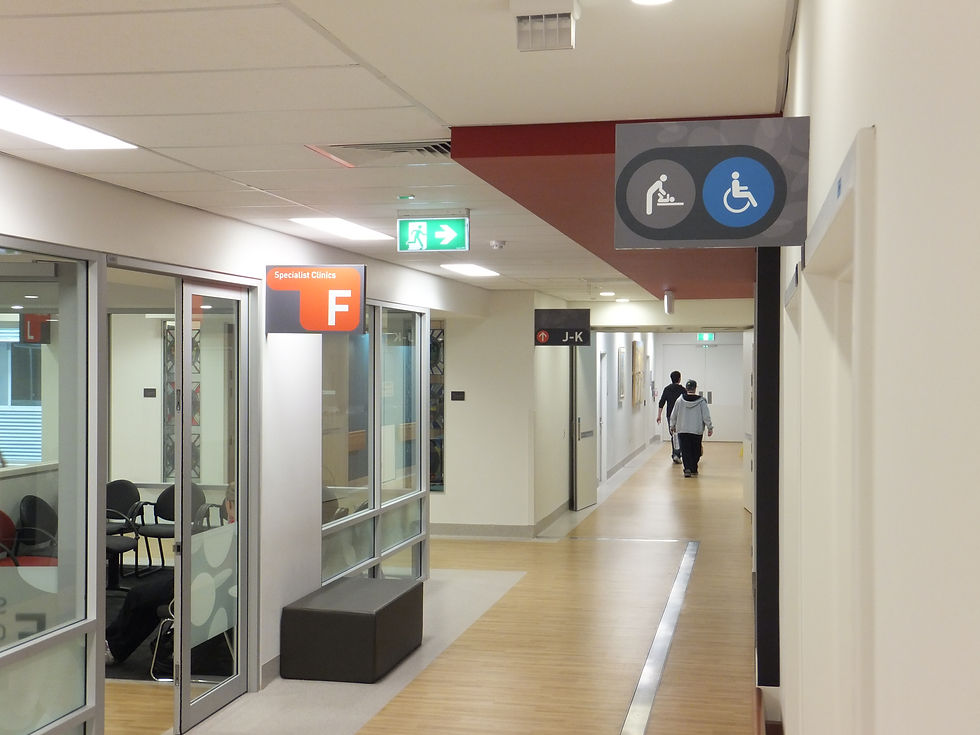
This was also the first time we introduced an alphanumeric coding system to an Australian hospital. While widely used in Europe and the US, this approach is less common in Australia. Its benefits are clear: coded destinations are easier to remember, faster to communicate, and simpler to integrate into digital tools. It also scales well as services grow and makes instructions clearer for both visitors and staff. Of course, this kind of system is familiar in many other parts of everyday life—like street numbering, supermarket aisles, airport gates, and train platforms. It helps people locate destinations quickly and confidently in complex environments, and hospitals are no different.
The final strategy accommodated the blend of historic and contemporary architecture while ensuring the site was easy to understand and navigate. Signage elements were designed to be legible, respectful of their context, and consistent across all buildings. With the alphanumeric framework in place, the hospital gained a structured, intuitive navigation system that continues to support daily operations and emergency response alike.