

Three campuses. One identity. Zero need to get lost.
Edith Cowan University (ECU) is named after the first woman elected to an Australian parliament—an institution built on ambition, access, and clarity of purpose. But until recently, its campuses told a different story.
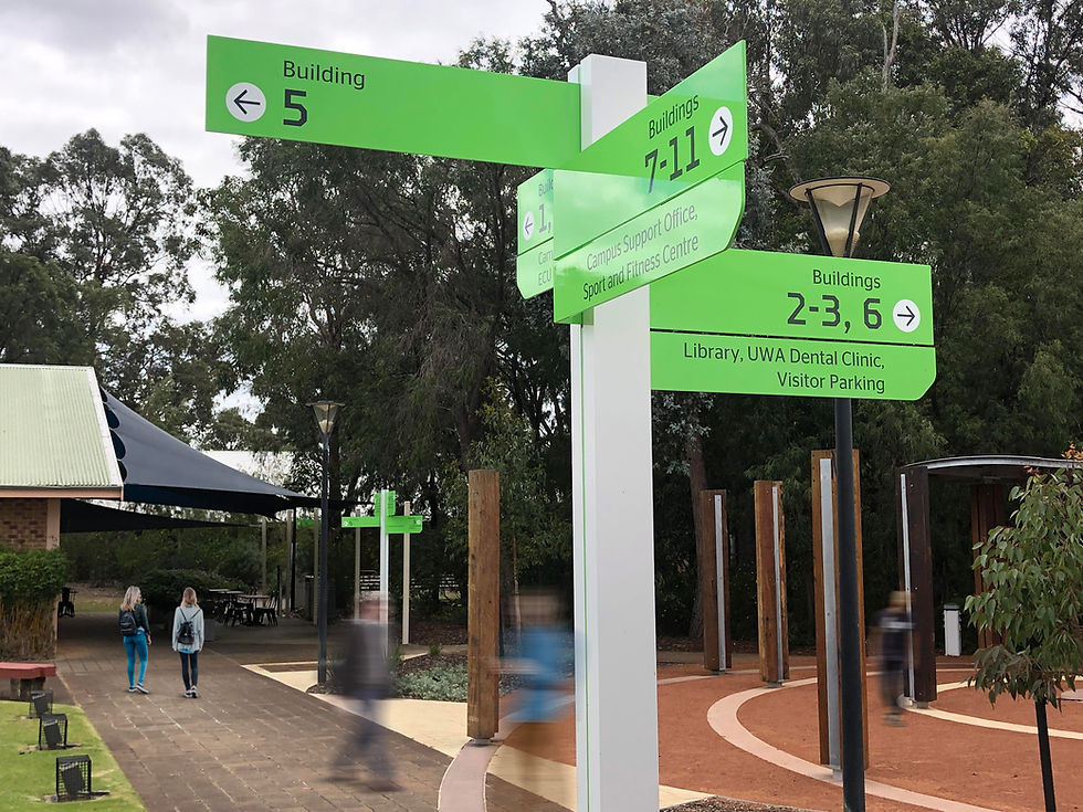
The wayfinding across all three campuses—Joondalup, Mt Lawley, and Bunbury—was messy, outdated, and hard to follow. Signs didn’t match reality. Updates were painful. And users—students, staff, and visitors—were getting lost. Frequently.
The university wanted more than new signage. It wanted a system that reflected the quality of its education, improved the campus experience, and gave ECU a stronger public-facing identity—one consistent voice across three very different places.

Project
Edith Cowan University
Client
Edith Cowan University
Collaborators
Location
Mt Lawley, Joondalup, Bunbury — Western Australia
Size
Mt Lawley: 25 hectares | Joondalup: 25 hectares | Bunbury: 14 hectares
Project Build Cost
Focus


The Problem
The issues weren’t cosmetic. Poor sign positioning, unclear mapping, inconsistent language, and legacy infrastructure had created a system no one trusted. There was no clear logic behind the carpark numbers. Directional signs often pointed to buildings that had moved or been renamed. Updates required new signs entirely—so they didn’t happen.
The bigger problem? Wayfinding had become a source of frustration for the very people ECU exists to support. And it didn’t reflect the kind of modern, user-centred learning environment ECU was known for.


What we did
We started on the ground—literally. Our team spent time across all three campuses: walking them, mapping them, and speaking with the people who used them every day. From those insights, we ran a series of user engagement workshops to surface pain points, behavioural patterns, and overlooked detail.
Then we got to work simplifying.
We rationalised the information shown at each sign location, eliminating unnecessary detail and helping people make decisions one step at a time. We restructured the carpark system to make it more logical and aligned with how people actually use the space.
Even compliance signage got a UX rethink. We collaborated with ECU’s law enforcement team to make parking infringement messages easier to understand—less legalese, more clarity.
The result? A system that uses 40% fewer signs than before, without losing functionality.


Design that’s both collaborative and considered
We spent a full week on site with ECU stakeholders to co-design the wayfinding hardware—bringing their team directly into the design process. This wasn’t just about finalising proportions or form. It was about building trust and shared ownership.
With the project over 3,000 kilometres from our Melbourne studio, this approach was deliberate. By being present and working side by side, we moved from “the consultants from over east” to part of the ECU team. That collaboration shaped not only the final product—but how it was received.
Colour selection was done in consultation with local Indigenous representatives, ensuring cultural relevance as well as visual contrast. This helped improve visibility, reinforce the university’s brand, and give the campuses a consistent tone of voice—something previous systems lacked entirely.
We documented every component and detail in a comprehensive signage manual, giving ECU full control over future additions and changes—without relying on guesswork or custom interventions.

The Outcome
The new system created clarity where there was once confusion. It gave ECU’s three campuses a unified visual language, reduced operational workload, and—most importantly—delivered a better experience for students, staff, and visitors.
By treating wayfinding as infrastructure rather than afterthought, ECU now has a system that feels purposeful, not piecemeal. It’s lighter on hardware, easier to maintain, and ready to support the university as it grows.
And most importantly, it finally reflects the quality of the experience happening inside ECU’s buildings—outside.


