

Bringing clarity to a cultural icon
State Library Victoria is one of Melbourne’s most recognisable public buildings. It spans an entire city block and attracts over two million visitors each year. It is the oldest and busiest state library in Australia and ranks as the fourth most visited library in the world.
Despite its popularity, the layout had become difficult to navigate. With 23 interconnected buildings developed over more than 160 years, the Library had become a beautiful but confusing maze. First-time visitors often got lost. Tourists wandered in circles. Students struggled to reach their workspaces or meetings on time.
The redevelopment of the Library was about more than restoring heritage features. It was a chance to create a public experience that felt accessible, intuitive, and future-ready. Our role was to make that experience work for everyone.

Project
State Library Victoria
Client
Department of Major Projects, State of Victoria
Collaborators
Schmidt Hammer Lassen (Copenhagen)
Architectus (Melbourne)
Location
Melbourne, Australia
Size
13,532 m²
Project Build Cost
AU $88 million | €56 million | US $68 million
Focus


The Challenge
The brief asked for a single wayfinding system to serve a place with many identities. Some people came to study. Others to meet, explore, relax, or recharge. The system had to support all of those needs without flattening the character of the space.
It also had to bridge old and new. The architecture layered contemporary insertions over a heritage core. The wayfinding needed to feel coherent across both, while remaining respectful and low-key.
This wasn’t a signage exercise. It was a user experience challenge. What information do people need, when do they need it, and how can we deliver it in a way that feels natural and easy to trust?


A complex brief with many voices
The project had a wide range of stakeholders. Each came with different priorities, agendas, and ideas of what mattered. Some of the complexity was technical. Some of it was political.
We focused on the people who would actually use the system. We built consensus where we could and made clear recommendations where it counted. Not every decision landed exactly as we would have chosen, but the final system works. It is clear, cohesive, and aligned with both the architecture and the operational reality.
The brief called for one consistent system across 23 buildings, over 160 years of construction, and countless user expectations. That’s what we delivered.


What we did
We worked from inside the Library itself. We watched people move, hesitate, ask for help, and eventually find their way. We spoke to tourists, researchers, students, and staff. We traced their journeys and identified the pressure points.
Two user types stood out. Visitors were happy to explore but still needed enough guidance to feel comfortable. Regular users wanted consistency, clarity, and predictability. We had to meet both needs. That meant creating moments of discovery and moments of certainty.
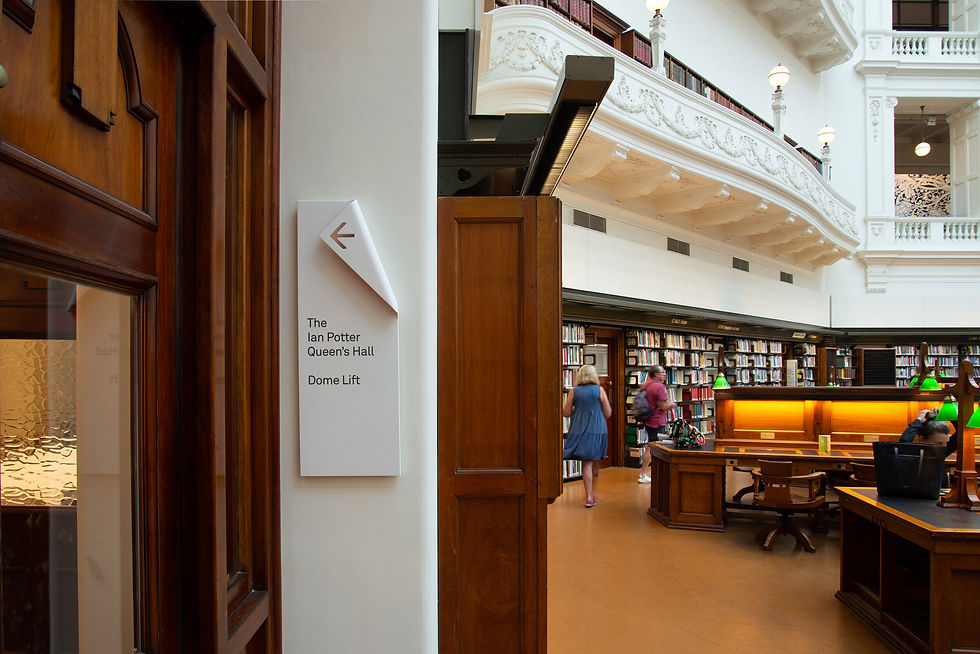
We introduced a zoning strategy that divided the Library into clearly marked sections. Each had its own visual identity, but all used a consistent design language. The result was a system that felt informative, calm, and unobtrusive. Information was layered and revealed progressively, based on how people actually move and decide.
We also addressed a major point of confusion. The main entrance was technically on Level 2, though most people expected it to be Ground. We recommended relabelling it to match public expectation. The Library agreed, and the change immediately made the building feel more logical.


Design that respects the space
The physical design of the signage took cues from the Library itself. The folded form referenced the crease of a paper page. It was architectural and symbolic without being literal. A soft orange glow added warmth and made the signs easy to spot without dominating the space.
Each sign was tested in the BIM model to ensure it sat comfortably within the architecture. Nothing felt tacked on. The system became part of the environment.
Like a good interface, it’s there when you need it, and fades into the background when you don’t.
The Outcome
The new system brings coherence to a fragmented environment. Tourists find their way to the La Trobe Reading Room without getting lost. Students move efficiently through the space. The Library feels more usable, more welcoming, and more human.
This was a user experience project from the beginning. We based the system on real journeys, real needs, and the behaviour of real people.
The architecture still speaks for itself. The heritage still shines. Now the navigation experience does too.
The project also received recognition from the Australian Graphic Design Association, taking out Best Spatial Design. A small nod to the clarity, restraint, and strategic thinking behind the work.


