When St John of God Murdoch Hospital added a large new Medical Suites building to their Western Australian campus, the experience on site started to shift. Visitors were struggling to find their way. The signage didn’t match the scale or complexity of the new layout. Staff were stepping in to give directions, and the calm, professional atmosphere that defines a good hospital experience was affected.
Like many of our health clients, Murdoch started with a Gap Analysis. This is a focused, five-day review that reveals where the navigation experience breaks down and what that means in practice. We look at how people move, where they hesitate, what gets in the way, and how staff are affected. The review maps the real experience, identifies points of friction, and lays out a clear, staged plan to improve it. That plan can be delivered all at once or rolled out over time.
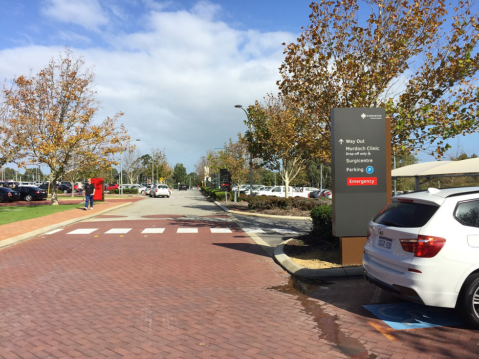
At Murdoch, the issues were layered. The signage had not kept up with the expanding site. Each new building came with its own logic, creating multiple systems with no clear links between them. The result was a fragmented experience.

Project
St John of God Murdoch Hospital
Client
St John of God Murdoch
Collaborators
Location
Perth, Australia
Size
Project Build Cost
Focus


We worked closely with staff and leadership to understand how people moved through the campus. Patients and visitors. Doctors and nurses. Support teams. This process-led approach allowed us to define a logical and intuitive system that supported everyone.
We then designed a signage package that brought clarity and consistency across the entire site. It reflected the St John of God brand and helped distinguish the campus from the neighbouring Fiona Stanley Hospital. Every sign, from arrival to destination, was considered as part of one connected experience.


As Roshan Weddikkara, Director of Business & Service Development at the hospital, put it:
"It became clear that our signage was inadequate. If we did not engage in a full wayfinding exercise, campus visitors would find it frustrating and difficult to find their destination, which would also result in frustrations of caregivers and doctors.
Humanics Collective worked closely with us to develop a design solution that meets our aesthetic, wayfinding, and communications requirements. The impact has been dramatic, with clear and easily articulable directions now able to be provided to consumers, a wayfinding style guide to enable ongoing work, a distinctiveness in the context of a complex wider precinct, and most importantly, a guiding philosophy which informs all campus wayfinding."


The campus now functions as one connected hospital environment. It is easier to navigate, less stressful to visit, and more efficient to work in.