

A hospital that feels more like a park
AZ Groeninge is one of Belgium’s largest hospitals—a 1,150-bed campus in Kortrijk, near the French border. The masterplan brought together four former hospitals into a single, integrated site designed to reduce stress and enhance wellbeing.
Five interconnected buildings, leafy courtyards, and generous daylight make this a hospital that feels more like a wellness destination. It’s serene, well-ordered, and architecturally refined.
But the first wave of signage didn’t reflect that.

Project
AZ Groeninge
Client
AZ Groeninge
Collaborators
Osar Architects
Baumschlager Eberle
Location
Kortrijk, Belgium
Size
1,154 beds | 115,280 m² floor area | 144,000 m² campus
Project Build Cost
€284 million
Focus


The Problem
When the first third of the building opened in 2010, a standard signage system was installed. It looked good on paper—but once the hospital was operational, issues emerged.
People got lost. Staff spent valuable time giving directions. Appointments were missed. Frustration built across patients, carers, and teams. The system simply didn’t work at scale.
AZ Groeninge had ambitions to be Belgium’s most user-friendly hospital. But the navigation experience wasn’t supporting that goal.
They had already spoken with a long list of suppliers and advisors. Most focused on signs and print runs. All suggested tweaks to the existing system—minor improvements to what was already there. Few considered user behaviour. None offered a true rethink. We proposed a complete redesign, starting from the user’s perspective and rebuilding the system around clarity, consistency, and long-term adaptability.
And this wasn’t a decision taken lightly. With over 100,000 square metres of clinical space in daily use, even a small error in the strategy could cascade into hours of lost time, confusion, and inefficiency across the hospital network. The system needed to be right—and it needed to last.


What we did
We began with an on-site Gap Analysis. We walked the campus, observed patients, spoke with staff, and pinpointed the pain points. Signage was too small. Contrast was poor. Corridor environments were repetitive and disorienting. The address system made sense on a plan—but not to the people using it.
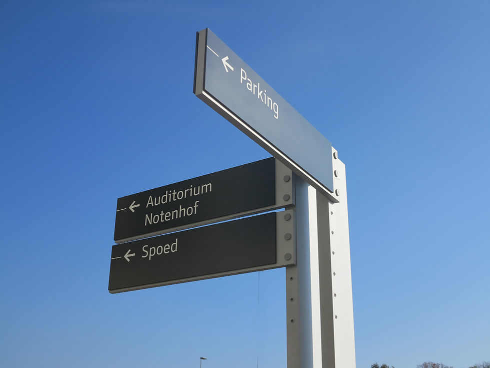
We proposed a new strategy that focused on clarity, consistency, and simplicity. A sequential numbering system replaced complex department names. Each zone was given a letter (B, C, D, E) and destination numbers were grouped into manageable blocks (e.g. B020–B029). These numbers matched the appointment tickets printed at check-in kiosks and aligned with digital information systems.
Whether patients were navigating independently or receiving a printout from a kiosk or receptionist, the information always matched. Staff could guide patients more efficiently. And if a clinic moved, the change was seamless: we simply assigned it a new destination number. None of the directional signage needed to be updated—only the sign at the new department entrance. That’s the benefit of a well-coded system: simple changes, no ripple effects.
This coded system also provided a smart solution to a uniquely Belgian challenge: language. In Flanders, where AZ Groeninge is located, all public signage is legally required to be in Dutch. Yet the hospital serves both Dutch- and French-speaking populations. By replacing lengthy, often Latin-sounding department names with short alphanumeric codes, we created a wayfinding system that was legally compliant and instantly more accessible—regardless of a person’s first language.
The result was a system that could adapt to cultural, linguistic, and operational realities without compromising usability.


Design that supports behaviour
We worked closely with Osar Architects to create a signage family that complemented the hospital’s architecture—clear, minimal, and deliberately neutral. Strong contrast, ergonomic legibility, and restrained placement made the system easy to use without dominating the space.
Environmental graphics were introduced at key junctions and lift lobbies, referencing familiar landscapes from the West Flanders region. These acted as visual anchors—grounding patients in place and helping them return to a location later without having to read a single sign.
We also collaborated with the hospital’s facilities and maintenance teams to make sure the solution was robust. Every sign was designed for modularity and ease of update—no specialist materials or tools required. A full signage manual gave the hospital control over future changes without re-engaging consultants for every decision.
All elements were tested on-site with users to validate performance before rollout. It was important not just that the strategy worked on paper, but that it worked in the hands of a nervous outpatient, a distracted visitor, or a porter moving quickly between departments.

Built to last
The system was built for flexibility and future growth. In 2024, nearly a decade after our original work, we were invited back to deliver wayfinding for the hospital’s final wing.
Because the core system was built on a consistent addressing structure from the outset, no signage had to be replaced in the existing buildings—only extended. It scaled exactly as planned.
And the project came in at just over 70% of the budget that had been allocated—despite being custom-designed. By using fewer, better-placed signs and a more intelligent system, AZ Groeninge gained clarity, consistency, and savings.
In practical terms, that meant less confusion, fewer change orders, and more time focused on patient care—not printing or explaining maps.
The Outcome
AZ Groeninge now has a wayfinding system that reflects the hospital’s vision: smart, serene, and purposefully human.
The strategy reduced signage volume, improved patient experience, and made daily operations smoother for staff. It’s easy to maintain, easy to expand, and easy to trust. It works for staff, patients, and visitors—whether you’ve been there 100 times or it’s your first day on site.
The system delivers what great design should: clear decisions, reduced stress, and an environment that feels effortless to move through—no matter who you are, or why you’re there.

