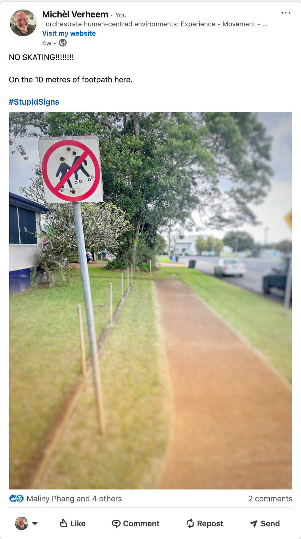
My fascination with # StupidSigns
- Michel Verheem

- Jun 15, 2025
- 2 min read
Updated: Jan 1, 2026
Why Bad Information Hurts Good Places
I’ve spent the past years collecting stupid signs. Not for laughs (though some are hilarious). But because they say something serious about how we design, manage, and experience public environments.
We’ve all seen them.
The taped-up A4 printed in Word.
The laminated instructions stuck to the lift.
The ten signs screaming from one pole.
The permanent 'temporary' note that’s been there since 2019.
Stupid signs aren’t just bad communication. They’re symptoms of deeper design failures.


StupidSigns don’t start stupid
No one sets out to make a stupid sign. They appear when something’s gone wrong. A layout isn’t working. A temporary change wasn’t planned for. Or users keep asking the same question and staff get sick of answering it. So someone grabs a marker and fixes the problem—badly.
Sometimes it's a band-aid. Sometimes it's a warning shot. Either way, the message is clear: the system didn’t work on its own.
They’re trying to tell us something
These signs show us where:
Movement isn’t intuitive
Information isn’t timely
Decisions aren’t obvious
Design hasn’t kept up with change
They reveal frustration. Gaps. Broken feedback loops. And they often shift blame, making users feel at fault for not understanding a system that never made sense to begin with.


Some are funny. Most are tragic.
A “resting spot” label on a bench, as if we wouldn’t know.
A sign banning signs, with no sense of irony.
An unreadable grey-on-grey sky sign that probably cost $100k.
Funny? Sure. But behind the joke is wasted money, wasted time, and lost trust.
The problem isn’t the sign. It’s the system.
Bad signs often don’t need redesigning. They just need replacing by something better than signs. Environments that communicate clearly through layout, flow, line of sight, material, and logic.
Smart signage is the last resort of a well-designed space.
If a user needs a sign to know where to go, how to behave, or what’s allowed, the space has already failed to tell them.
This isn’t just theory. Cities like Leeuwarden in the Netherlands have taken this seriously, removing more than 1,000 traffic signs—over 10% of all signage. Why? Because too many signs create noise, not clarity. National organisations estimate that about 20% of road signs in the Netherlands serve no real purpose. Instead of helping drivers, they overload them. By clearing the clutter, these cities are improving safety, reducing maintenance, and making public environments easier to understand. It also makes the remaining information more visible and effective, and saves councils real money on upkeep and replacement. Fewer signs, better systems.
So what now?
Stupid signs are free lessons in what’s not working. I’ll keep collecting them because they point to what needs fixing.
But the goal isn’t more or cleverer signs. It’s better environments. The kind where people just know what to do, where to go, and how to feel, without needing a label slapped on everything.
Let’s stop solving problems with signs.
Let’s design places that make sense in the first place.


